Rustic interiors look effortless in photographs and slightly staged in real life, and the reason is almost never a shortage of good pieces. It is usually an excess of them, combined with a few quiet decisions nobody thinks to question: the fourth wood tone, the third knitted throw, the burlap runner that seemed like a good idea in the shop. Most of these problems are solved by editing rather than shopping. What follows are the mistakes that show up most often in country and farmhouse rooms, and the corrections that make a space feel settled again.
Overdoing the Theme Until the Room Becomes a Set
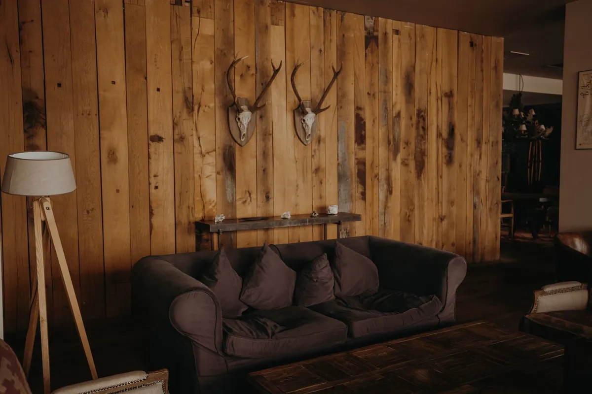
Rustic design reads best when it looks inherited rather than assembled. Trouble starts when every surface carries a motif. Within three metres you find a rope-wrapped mirror, an antler chandelier, a cowhide rug, a distressed crate shelf and a sign about fresh eggs. None of these objects is bad. Together they stop being a room and become a display.
The correction is a simple rule: one hero per sightline. Stand in the doorway and look across the room. Whichever piece you want people to notice first stays; everything else in that view should support it quietly. If the stone fireplace is the hero, the mantel does not also need a wagon wheel.
Repetition, not multiplication
Material repetition makes a scheme feel intentional, but three is usually the limit. Three touches of aged brass, three pieces of dark wood, three linen textures. Past that, the eye stops reading rhythm and starts reading clutter. When in doubt, remove the smallest items first — they are almost always the ones shouting the theme.
It also helps to decide which rustic you are actually working in. Stone-and-plaster Mediterranean, alpine wood-and-wool, painted practical farmhouse and weathered colonial are different languages. Two can coexist. Four produce a film set.
Fabric Mistakes: Matching Everything, or Mixing Everything
Textiles do more for a rustic room than furniture does, and they are where most schemes go wrong. The errors tend to fall into two opposite camps.
The matchy trap
Sofa, cushions, curtains and rug all in the same beige weave feels safe and reads flat. With no variation in weight, drape or sheen, the room turns into a hotel lobby. Add contrast instead of colour: keep the palette but change the cloth.
The everything-at-once trap
Burlap, jute, ticking stripe, mohair, faux fur and crochet in one corner is not layered, it is loud. Rough textures compete rather than support each other.
A workable method is to give every textile a role:
- Dominant — the largest area: curtains, rug or upholstery in a calm, mid-weight cloth.
- Supporting — one step rougher or heavier: wool, slubby linen, a chunky knit.
- Accent — small and contrasting: a leather cushion, a striped throw, a velvet stool.
Then apply the smooth-partner rule. For every rough fabric in a seating area, place one smooth one nearby: a leather ottoman beside a jute rug, a crisp cotton shade above a wool sofa. Mix cushion sizes rather than counts — a 55 cm square, a 45 cm square and a small rectangular lumbar will look considered where four identical squares look like a set.
Texture Imbalance: When Everything Is Rough
Stone floor, exposed brick, ceiling beams, plank walls, chunky knit, jute rug. It is a beautiful list and a tiring room. Roughness is a wonderful flavour and a poor main course, because the eye finds nothing to rest against.
The fix is rarely colour — it is reflectivity. Introduce one smooth or glossy element in every corner: a glazed ceramic vase, a plain mirror, a glass lamp base, polished plaster, a blackened steel side table, a single pane of clear glass. Even a small amount of sheen makes raw timber look richer by contrast.
A useful test: photograph the room in greyscale. If every surface sits in the same mid-tone and every texture runs in the same direction, the composition is flat. You need a light value, a dark value and one surface that catches light differently from its neighbours.
Balance works both ways. When textures are busy, keep the palette tight. When the palette is bold, keep the textures calm.
Letting Wood Take Over Every Surface
Wood is the backbone of rustic styling, and it is easy to collect too many versions of it. Orange pine floorboards, grey-washed oak table, reddish mahogany dresser and yellow bamboo stool in one room creates a quiet argument nobody can name.
Limit yourself to two tones: one dominant for the big surfaces — floor, ceiling, large case pieces — and one accent. Repeat the accent two or three times so it reads as a decision rather than a leftover. Keep a third tone out of the same metre of space; distance helps the eye forgive.
If you already own conflicting pieces, separate them. A runner or rug between an orange-toned floor and a grey table does more than any amount of restyling. Painted furniture is the other reliable escape route: a soft off-white or deep green dresser interrupts the wood conversation without fighting it.
Palette and Light: The Muddy Evening Problem
Plenty of rustic rooms look lovely at noon and heavy after dark. The usual cause is brown layered on brown with warm undertones, lit by a single bulb overhead.
Give the scheme two anchors: one cool neutral — soft white, mushroom, sage-grey — and one dark value, such as charcoal, near-black or deep green. The wood supplies the warmth, so the walls do not have to. This is why pale plaster and off-white walls flatter old beams so well.
Then fix the lighting in layers: an overhead source for general light, a task light for reading or a kitchen counter, and one low source — a table lamp or floor lamp — to create shadow. Warm white bulbs around 2700K on a dimmer will make timber and wool look their best; cool white turns them grey and clinical. A linen shade diffuses light beautifully across rough walls. Resist the urge to make the room bright. Rustic texture only appears when there is some shadow to reveal it.
Scale and Comfort Oversights
A few practical errors undo otherwise good styling. Rugs that float in the middle of a seating group make furniture look unmoored; choose one large enough that at least the front legs of every seat sit on it. Sofas pushed against all four walls create a waiting room rather than a conversation; pull them in, even by thirty centimetres. Oversized sectionals in low-beamed rooms swallow the architecture, and dark paint on a low ceiling makes beams feel closer than they are.
Hang curtains high and wide, well beyond the window frame, to lend height. Let one piece in the room be genuinely tall. And keep at least one surface deliberately empty — a bare wall or cleared table is what tells the eye the room is finished rather than unfinished.
A Short Reset to Try This Weekend
- Clear every small decorative object into a box. Put back only five per room, chosen for size and texture rather than sentiment.
- Pick one hero per sightline and move anything that competes with it.
- Assign each textile a role — dominant, supporting, accent — and remove duplicates.
- Add one smooth or reflective piece to each corner that feels heavy.
- Count your wood tones. If there are more than two, separate or paint.
- Add a low lamp, warm the bulbs, and dim the overhead light.
- Live with the room for a week before buying anything new.
Most rustic rooms need less decoration, not more. Edit firmly, keep the pieces with real age and weight, and let the gaps do some of the work.
Photo: Dương Nhân / Pexels